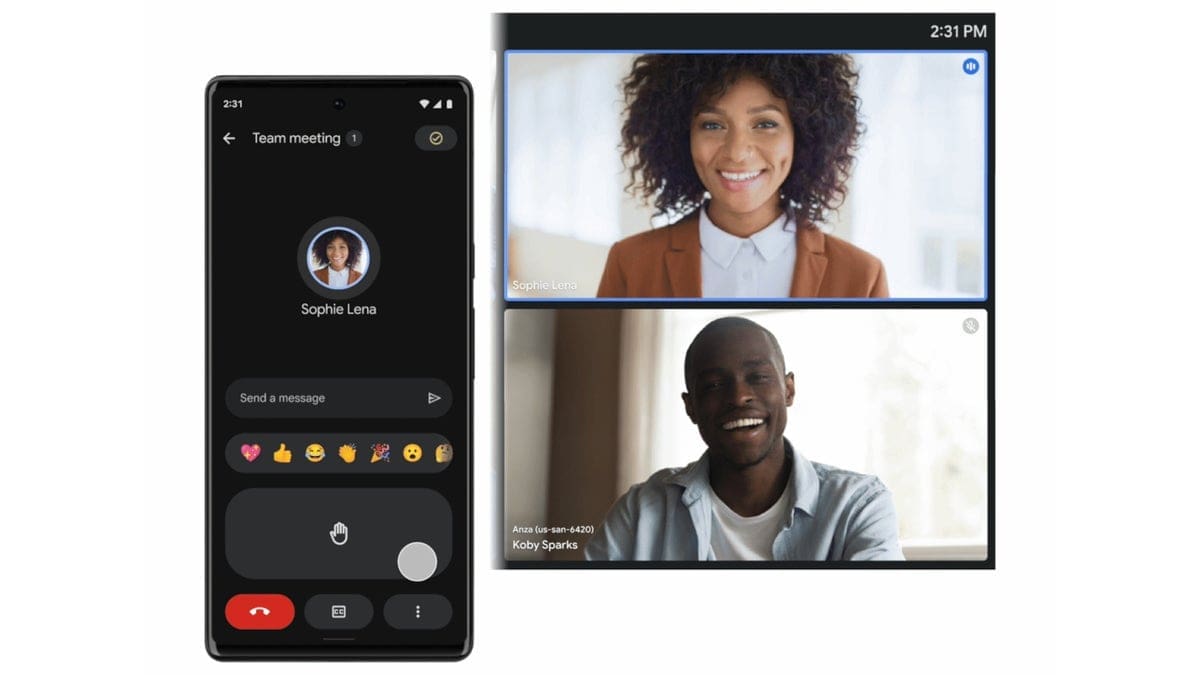
Google is enhancing the in-call experience on Google Meet with a new design that gives the app a fresh and modern look. The Material 3 Design System is now being rolled out to users worldwide, with more updates planned for the coming year to make it easier for users to access meeting features seamlessly.
The latest update focuses on improving the lower in-call controls in Meet. The controls now feature vibrant colors and dynamic shapes to indicate when the user is muted or when the controls are active. These visual changes aim to enhance the user experience without altering any functionalities.
Users can expect to see these design updates while using Google Meet on the web, in picture-in-picture mode, within other apps like Docs and Slides, and even when using meeting room hardware in conference rooms. The rollout of this new design has already begun and is expected to reach all Google Workspace customers and users with personal Google accounts within two weeks.
Stay tuned for more visual enhancements and improvements as Google continues to update Google Meet over the next year. The goal is to make accessing meeting features more intuitive and seamless for all users. Experience the new design firsthand and elevate your virtual meetings with Google Meet!

