Google Maps has undergone a significant visual transformation which was announced back in the beginning of the month. The overhaul included some new features but also introduced a new, cooler color palette that was received with mixed reactions. While the original rollout only included Android, iOS, and the web versions of Maps, it is now also rolling out to the Android Auto counterpart.
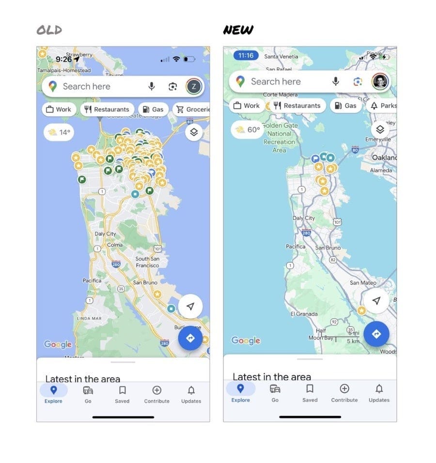
The new design’s color palette replaces the traditional warm hues with a refreshing and contemporary aesthetic, designed to enhance usability and improve the overall user experience. The most noticeable change is the replacement of the familiar tan color for roads with a range of grays.
The intent for this shift was to make roads stand out more prominently against the backdrop of parks and forests, which now feature a lighter shade of green. Additionally, freeways were given a darker gray hue with subtle blue undertones, blending seamlessly with water bodies that now display a lighter blue shade.
These changes are complemented by a reduction in the use of yellow, which allows orange pins for restaurants to stand out more distinctly. This design choice is meant to ensure that key points of interest are easily identifiable, enhancing the overall usability of the app. The new color scheme also extends beyond the map itself, permeating the app’s user interface.
As reported by 9to5Google, these changes have been found by many users of the app to be quite jarring and even dangerous. The sentiment echoes throughout Reddit and other social media with users stating that the new colors make it difficult to discern between road types. Even an ex-Google Maps designer felt the need to chime in on her discontent with the direction the Google Maps team has taken.
Source – @elizlaraki on X
In fact, users have found the new scheme with brighter colors to mimic Apple Maps’ and have taken to Google Maps support to express their frustration. While Google finds the new palette to offer several advantages and enhance legibility, it does not appear that the user base agrees with this opinion.
Google has been gradually rolling out the new color palette since October, with testing beginning in August. The update is now widely available across the web, Android, and iOS platforms, including Android Auto. It remains unclear what Google’s position is on the users’ complaints or whether the company intends to implement further changes.