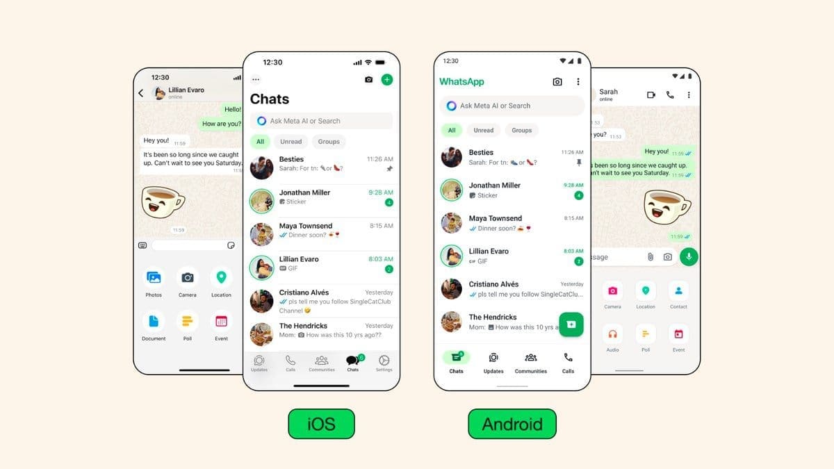
WhatsApp, one of the world’s most popular messaging apps, has recently undergone a significant visual upgrade. Meta, the parent company, has made changes to enhance the app’s user experience and keep its look current. The new update includes refreshing colors, updated icons, and subtle animations.
– The most noticeable change when you launch the redesigned app is the new color scheme. WhatsApp’s signature green is now more prominent, complemented by neutral tones for a touch of sophistication.
– Users who prefer a darker interface will appreciate the deeper dark mode option, perfect for low-light situations.
– The update touches nearly every visual element of the app. Icons have a cleaner and more contemporary style that aligns with current design trends.
– Updated illustrations add visual charm and clarity to different parts of the app.
– Even subtle details like the default background, known as the “doodle,” have been refreshed with more familiar shapes.
In addition to visual updates, functionality improvements are also part of this update:
– Android users will welcome the change in navigation bar placement as it has moved from the top to the bottom of the app. This makes essential functions more easily accessible, especially for users with larger phones.
– iOS users will benefit from an expandable attachment tray that simplifies attaching videos, documents, and other files.
This extensive design refresh is available for both Android and iOS users. With ongoing development and recent changes within the app, WhatsApp demonstrates its commitment to enhancing its popular messaging platform. The updated look and feel provide users with a seamless and up-to-date experience. This redesign showcases that even established apps can benefit from thoughtful visual overhauls.