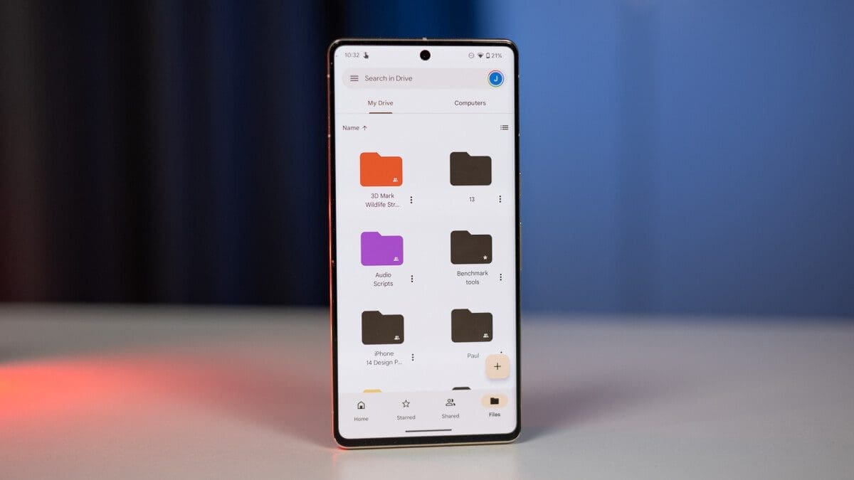
Google Drive is introducing a new two-page layout on larger screens, including foldable phones and tablets. This update is a significant improvement over the current layout, which only stretches the portrait UI to fit landscape screens.
The new two-page layout option has been spotted by @AssembleDebug on X and seems to be appearing widely with version 2.23.407.1 of the Google Drive app on Android. However, it has also been replicated on a foldable device using the current version (v2.23.397.0) found on the Play Store. It appears that this is currently being beta tested, so availability may vary. If the feature is available to you, you will see a new button on the top right of the document viewer, just before the three-dot menu. Tapping this button will activate the new view.
This new layout will greatly improve the reading and scanning experience for users on large-screen devices. It allows users to view two consecutive pages side by side, making it easier to compare and contrast different parts of a document. Additionally, the new layout enables users to see more content on the screen at once, reducing the need to scroll up and down.
The two-page layout option is a significant change for the Drive app on Android, addressing a long-standing complaint from foldable device users. The previous portrait-only layout was not suitable for larger screens and made it difficult to navigate between different pages of a document.
There is currently no specific timeline for when the two-page layout will be widely available. However, it is expected that the feature will be rolled out to all users in a future update of the Google Drive app. This improvement will be welcomed by users who heavily rely on Google Drive for productivity on large-screen devices.

