Huawei continues to be a major player in the smartphone industry, despite the challenges it has faced due to the US trade embargo. The company has recently launched its new flagship phones, the Huawei Mate 60, Mate 60 Pro, and Mate 60 Pro+, all of which feature stunning designs and innovative features. Interestingly, Huawei chose to release these phones just before the highly anticipated launch of the iPhone 15 series.
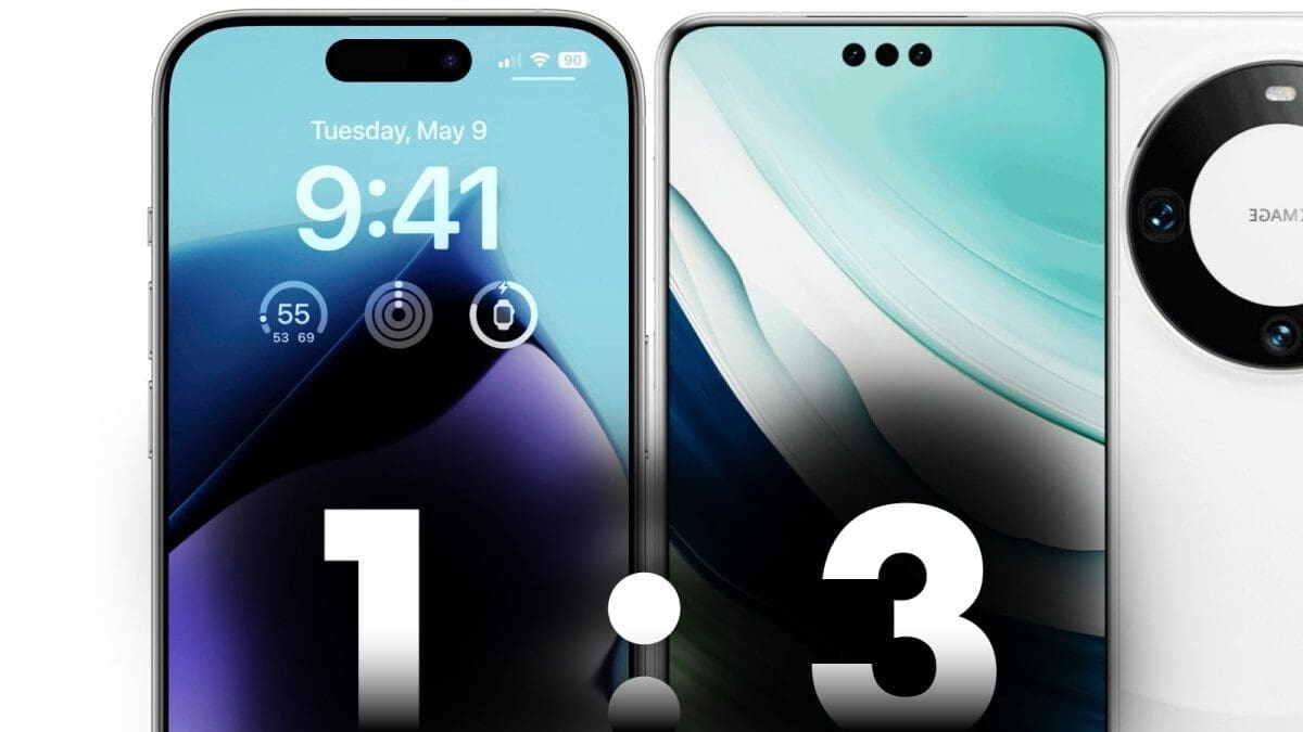
One of the standout design features of the Huawei Mate 60 Pro is its use of “Dynamic Islands,” which are similar to the cutout on the iPhone 15 Pro. However, Huawei takes it a step further by incorporating three Dynamic Islands instead of just one. This adds an intriguing twist to the design and gives users the option to choose a unified display cutout or the traditional Huawei P40 Pro-style cutout.
Another notable aspect of the Huawei Mate 60 Pro’s design is its symmetry. The phone features super thin symmetrical display borders, making it look cleaner and more elegant. Additionally, Huawei brings back its iconic camera ring, which adds to the overall aesthetic appeal of the device.
When it comes to competing with Apple’s dominance in the premium smartphone market, Android phones should strive to offer unique and practical designs. While the iPhone’s design may be popular, Android should focus on providing different options and bold form-factors. Not all Android flagships need to adopt the Dynamic Island cutout; instead, they should prioritize their own distinct design elements.
In conclusion, the Huawei Mate 60 Pro stands out for its symmetrical design, innovative use of Dynamic Islands, and attention to detail. While it would have been even more impressive with access to Google apps and the iconic Leica logo, it still showcases Huawei’s commitment to pushing the boundaries of smartphone design.


