When it comes to smartphone design, everyone has their own preferences. The aspect that seems to unite most people is display borders – the thinner, the better. But what about symmetrical borders? Not every phone-maker prioritizes them.
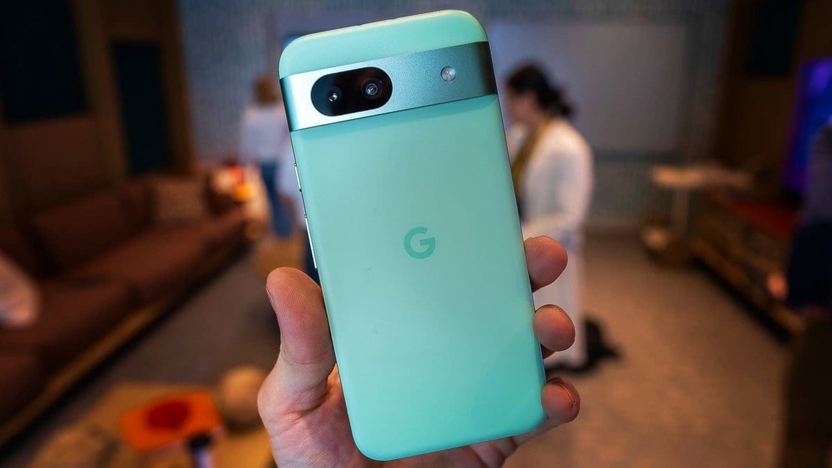
Enter Samsung and Google, two influential players in the smartphone market. Their latest mid-range offerings, the Galaxy A55 and Pixel 8a, seem to take a step back in design compared to their predecessors from 2019-2021. It’s almost as if they intentionally make these new phones look older than they are.
The design choices made by Samsung and Google have raised some eyebrows. The Pixel 8a has thicker display borders than its predecessor, giving it an outdated look. And the Galaxy A55 maintains a design that hasn’t evolved much from previous models.
It appears that these companies are deliberately giving their mid-range phones thick and asymmetrical borders to differentiate them from their flagship models. This lack of consistency in design may not sit well with some consumers who value symmetry in their devices.
Despite the dated appearance caused by thick borders, the Pixel 8a still offers great value for its price point. It can perform just as well as Google’s $1,000 flagship but at half the cost. While the bezels may not be on par with more modern designs, the overall value of the Pixel 8a outweighs this drawback.
It’s concerning that major players like Google and Samsung are willing to compromise on design for their mid-range phones just to boost sales of their flagship devices. This strategy may not always resonate with consumers who seek modern aesthetics in their smartphones.
In contrast, Sony’s Xperia 1 VI flagship manages to maintain a classic design with symmetrical borders while still offering a contemporary look. Perhaps considering alternatives like Sony’s phones could send a message to manufacturers about prioritizing consistent and appealing design choices in all their products.


