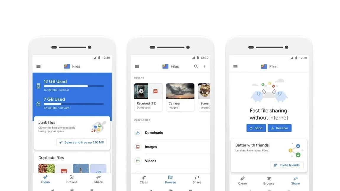
The latest beta version of the Files by Google app on Android has introduced an exciting update to its “Recents” feature, enhancing the user experience by making it quicker and more convenient to access recent files.
Previously, the “Recents” section displayed folders like Camera, Screenshots, and Downloads in a 2×2 grid format with small previews of each folder’s contents. Users had to tap on a folder and navigate through it to find a specific file.
Now, with the latest beta release, “Recents” has been revamped into a carousel of rectangular cards that directly display previews of individual files, including images and documents. This new design eliminates the need to navigate through folders, enabling users to find and open recent files faster and easier.
Key features of the updated “Recents” carousel include:
– Each card displays the file name and extension at the bottom
– A three-dot overflow menu for quick actions like sharing, deleting, or adding files to starred items
– The carousel shows 10 items at a time
– Users can tap “See all” to access a new tab view organizing files by folders
This refreshed “Recents” feature mirrors the carousel design used in Google Photos for its Memories feature, focusing on speed and convenience for users. The update is currently available in version 1.4374.x of Files by Google’s beta version.
Overall, this enhancement significantly improves the user experience of Files by Google, making it more efficient and user-friendly for accessing recent files. Regular users of the app will likely appreciate this change as it streamlines file access without having to navigate through folders extensively.

