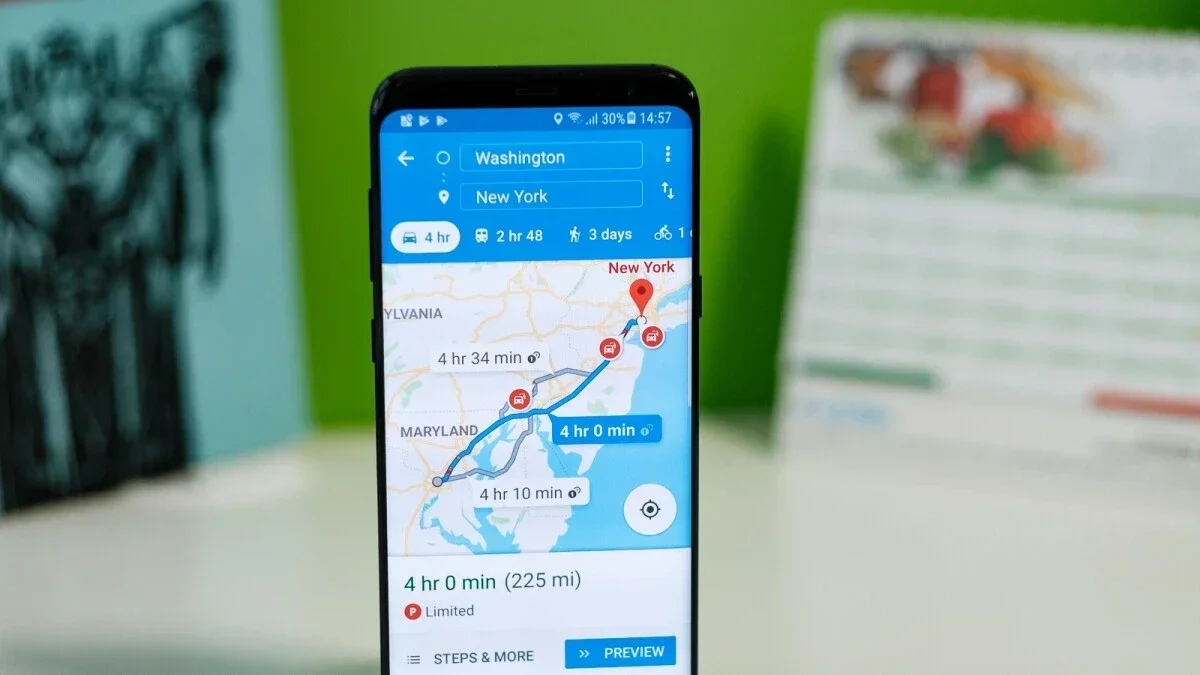
Google is making changes to the UI of its Google Maps app on Android and iOS to declutter the interface and make it easier for users to navigate. When you’re behind the wheel, you want to be able to glance at your map without being distracted by other elements on the screen, and that’s exactly what Google is aiming for with these changes.
Here are the key updates that you can expect:
– The top half of the screen will show a map of the area surrounding your desired location, while the bottom half will display photos of the location.
– The sheet at the bottom of the app is no longer full-screen and is slightly narrower at the top, allowing you to view a small section of the map at the top of your screen.
– The Public Transport sheet will also no longer take up the full screen.
While these changes may seem minor, they make a big difference in how connected you feel to your navigation map. This new UI has been spotted in version 11.113.x of Google Maps on Android, but it’s likely an A/B test as it hasn’t rolled out to all users yet. It’s expected to eventually make its way to iOS as well.
Some users may see these changes as insignificant, while others will appreciate them for making their navigation experience smoother. Regardless of where you stand, it’s clear that Google is committed to improving user experience with its Maps app.

