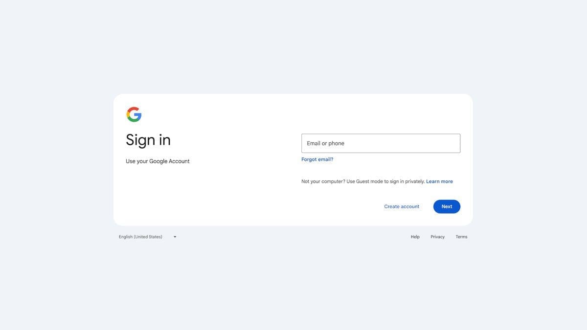
Google has recently updated the user interface for signing in to or signing up for Google Accounts, aligning it with the Material Design language used in the company’s other products. This update brings a fresh look to the sign-in page on both web and mobile platforms, with no functionality impacts or other changes beyond the visual appearance.
The visual changes may not be significant, but this is actually a good thing as it avoids confusing users who have been accustomed to the same UI for years. The new design is sleek and streamlined, making it easier and more intuitive to navigate.
Here’s what you need to know about the updated Google sign-in interface:
– The changes will automatically appear for all users without any action required.
– Google estimates that it may take up to 15 days for everyone to see the new interface.
– The roll-out started on February 21, so all Google Workspace customers and personal account users should have access to the new interface by March 4 at the latest.
The updated user interface enhances the overall user experience and brings a modern touch to Google’s sign-in process. With its seamless integration of Material Design principles, accessing your Google Account is now more visually appealing and user-friendly. Keep an eye out for these changes as they gradually make their way to your devices!

