In addition to the many new features coming to Google Messages soon in honor of RCS surpassing one billion monthly active users, the app is also preparing to unveil an update to its text field, introducing a dedicated shortcuts bar and a left-aligned layout.
Previously, the RCS/text message field occupied the right two-thirds of the screen, with key functions like “plus,” gallery, and Magic Compose disappearing as you typed. Emoji and voice memo shortcuts resided on the opposite end, creating a scattered and sometimes frustrating user experience. However, as noted by 9to5Google, this changes with the new layout which has the interface cleverly splitting into two distinct lines as you start typing. The text field now takes a bold left-aligned stance, mirroring the flow of conversation. This shift is accompanied by a dedicated shortcuts bar that keeps “plus,” Magic Compose, the gallery (sporting a fresh icon), and the voice recorder readily accessible, regardless of text input.

Google Messages text field before redesign | Credit: Phone Arena
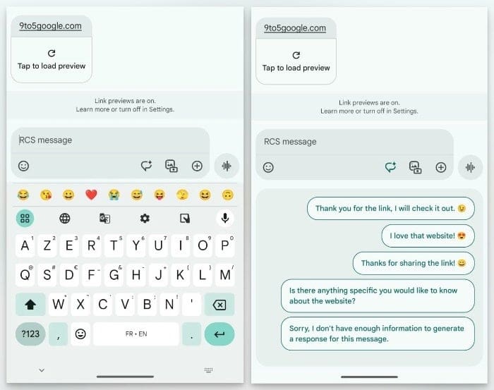

Google Messages text field after redesign | Credit: 9to5Google
The voice recorder feature is also no longer relegated to the sidelines, as it now gets its own button, possibly in preparation for its integration with the Moods feature announced last week. The new split-level interface, with the text field on top and the shortcuts bar below, might come across as jarring at first, but I believe will be beneficial as more features are added and more real estate may be needed for additional shortcuts.
Some early adopters in the Google Messages beta program are already seeing this text field transformation, though wider availability is yet to come. However, with Google actively rolling out the update alongside other noteworthy features announced earlier this week, it’s safe to say Google is putting all their weight behind making Google Messages a highly competitive messaging app and not afraid to roll out these changes more widely.


