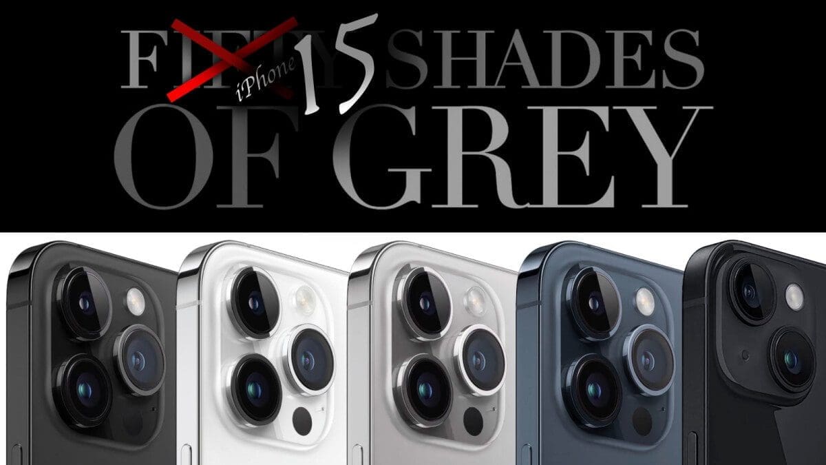
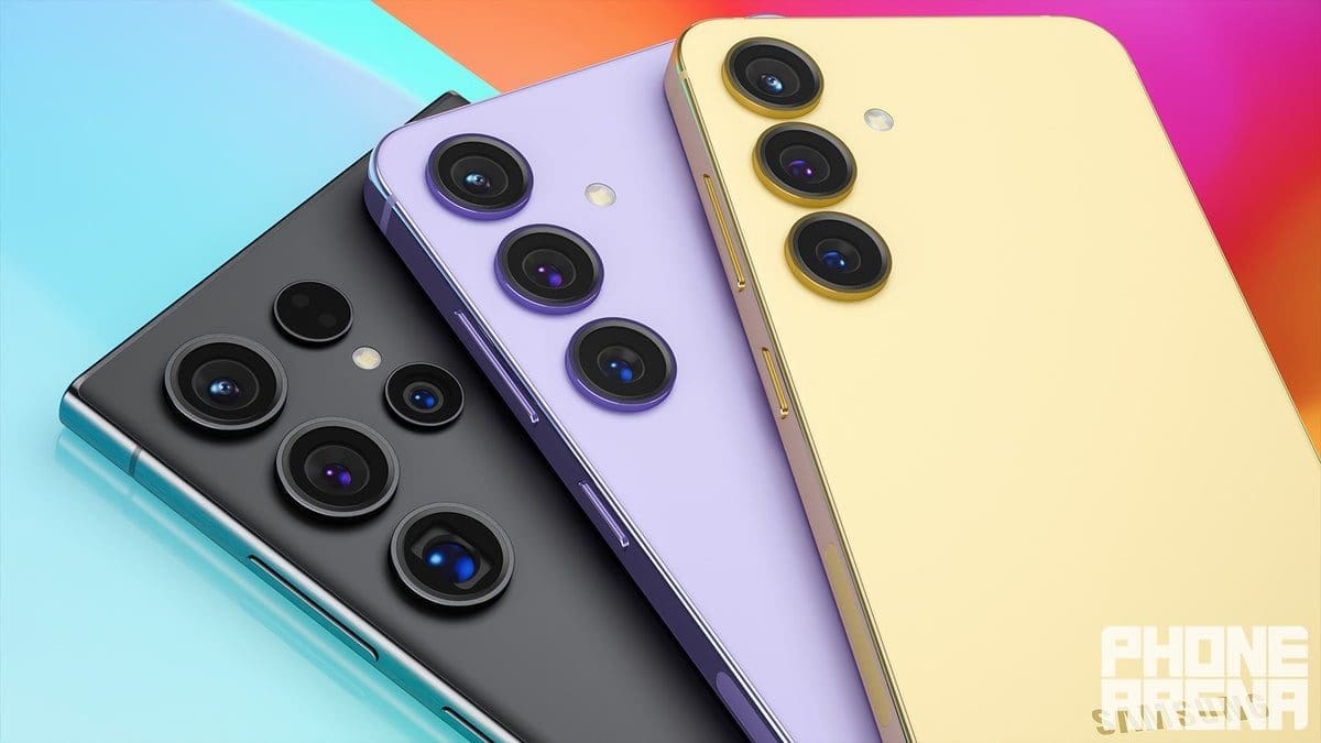
Muted and “boring” smartphone colors have become a common trend in recent years. This can be seen in flagship phones like the iPhone Pro and Galaxy Ultra series, which often feature grayscale patterns. Even the more affordable vanilla iPhones and Galaxy phones tend to stick to pastel colors, resulting in a somewhat vanilla appearance.
One recent example is the “Deep Purple” iPhone 14 Pro, which is underwhelming in person. The color appears barely purple under most lighting conditions, potentially due to the shade Apple chose. This raises the question of why smartphone colors have become increasingly muted, and whether it even matters.
Leaked renders and information suggest that the upcoming iPhone 15 Pro and iPhone 15 will also follow this muted color trend. In fact, these models may have even more monotone color options compared to the past five or six years of iPhone releases.
So, why is Apple avoiding vibrant and fun colors for its flagship iPhones? One possibility is that the new titanium frame of the iPhone 15 Pro may not look as appealing when painted. Brighter colors might clash with the brushed titanium and result in a less aesthetically pleasing appearance. Another explanation could be that Apple is catering to market preferences, as white, gray, dark gray, and black are the most popular car colors in the US.
Another theory is that Apple wants to sell more accessories and cases. By offering neutral-colored phones, users may be more inclined to purchase colorful cases, providing an opportunity for upselling. Additionally, Apple may be saving more vibrant color options for its traditional spring color refresh, where new colors are introduced to the lineup.
To compensate for the lack of exciting colors, Apple might include color-matched charging cables with the iPhone 15. While this may not fully satisfy users, it offers some variety.
The question remains: should fun smartphone colors make a comeback, or are muted colors acceptable for premium phones like the iPhone 15 Pro and Galaxy S23 Ultra? While many tech enthusiasts express disappointment over the lack of vibrant options, the color of a phone may not be as important if it’s going to be covered by a case.
Ultimately, Apple and Samsung have the final say in how they design their phones. However, as someone who has been following the industry for a while, it’s hard to ignore the times when smartphones were more fun and colorful. Personal favorite smartphone colors include Sorta Sunny for the Pixel 6 Pro, “Panda” for the Pixel 2 XL, Emerald Green for the Galaxy S7, Amber Sunrise for the Huawei P30 Pro, and the Jupiter Rock Edition for the OnePlus 11.
While color choice may not be the most crucial aspect of a phone’s design, it can contribute to the overall appeal and user experience.